Discover the timeless paint shades and color combinations that stand the test of time…I can’t tell you HOW many mistakes I’ve seen in paint color selections!! And, if I’m honest…even I’ve made a couple choices I didn’t feel crazy about later.
Let me put it this way…you KNOW it’s bad when the painters leave and you’re already asking yourself, “What have I done?”
And then you have to live with the shade for years!
Thankfully, there are a few timeless paint colors you can ALWAYS choose from. These are the shades you’ll never get sick of…those that will always keep the look and feel you want—for any space.
Let’s take a look.
Black and white

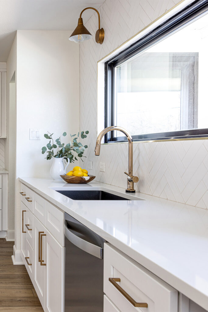
Your color choices don’t get any simpler than black and white! This high-contrast combination is both sophisticated and dramatic. One of my FAVORITE applications of this combo is in kitchens…the accent of silvery appliances keeps the space feeling classy…
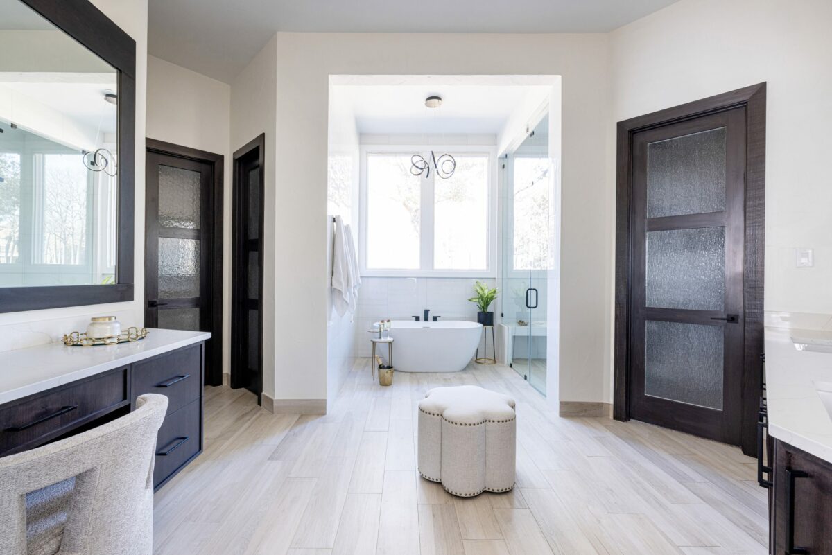
If you want to use black and white in the bathroom, your choice of flooring can be paired to actually ACCENT the high contrast…with the right tile to warm that room up, your bathroom can feel classy AND snappy at the same time.
“Greige”
Give way to LAYERS of beiges and greys…hello, “greige!”
Greige combines the warmth of beige with today’s chic grey, while side-stepping the inevitability that gray-only tones WILL fall out of fashion.
Yes. People ARE getting tired of “50 shades of grey.” The design industry is moving on.
Today’s trends in grey are finally broadening their horizons…and the resulting tones are working in styles ALL over the house.
Expert tip: Greige is especially beautiful with rustic décor. Add accents of cream to brighten the scene in a surprising way…
Navy blue
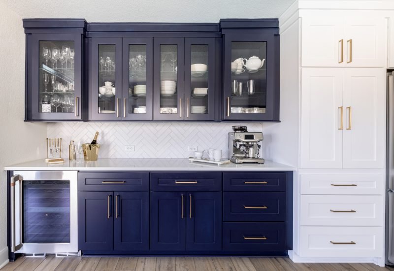
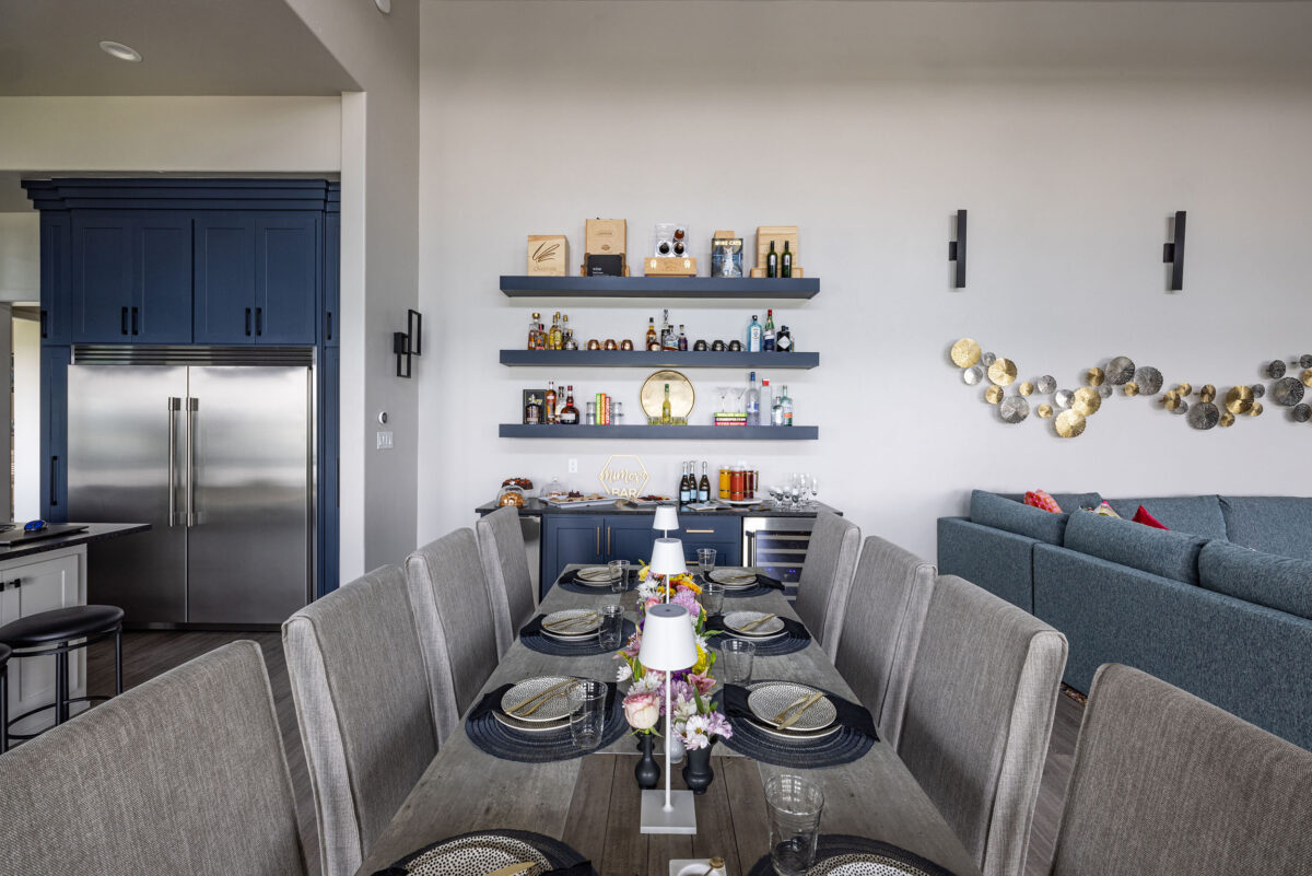
Navy blue is the “new black” when it comes to selecting a timeless color that, despite its richness, can be elegantly neutral. If you aren’t sold on navy alone, you can add paint texturing to create a sense of color scheme that fits the mood AND feel of the room…
Texture in your furnishings can also be paired with a smooth and beautiful navy blue—especially neutral accents in shelving and flooring to give the room space to BREATHE.

Expert tip: Navy blue is a “cool” color, so avoid mixing it with warm colors if you want to steer clear of that “dated” look later. You’ll see a LOT of navy with white and BRIGHT pops of yellow or orange in design magazines today…but don’t be fooled. This pop of color can be done without mixing opposite ends of the paint palette!! You can always look to nature for ageless color combos…think about deep sea blues with cresting whitecaps…look around, and you’ll find a natural and timeless inspiration.
BONUS: Creamy white, brown, and leaf green
Cream and green are two timeless colors that come together for one of nature’s most DISTINCTIVE palettes…flooring and furnishings can weave in brown highlights to create a space that is not only beautiful, but naturally relaxing.

Luxury could be a paint choice away…but the days of standing in front of THOUSANDS of paint swatches are over! After hundreds of remodels, I’ve had the honor of working with SO many homeowners to select their paint colors…and it’s honestly one of my favorite parts of even the BIGGEST projects!!
Please reach out to talk about paint!! I have more tips like this. It just comes down to the look and the feel you want for your home.

