Kitchen Redesign and Revival in Trophy Club West, Trophy Club
This client had worked with Signature Home Services before their kitchen renovation. After a primary bathroom project that repurposed space from an adjacent closet, this client was confident that the Signature design team could come up with masterful solutions for the kitchen, too. And the kitchen definitely needed it.
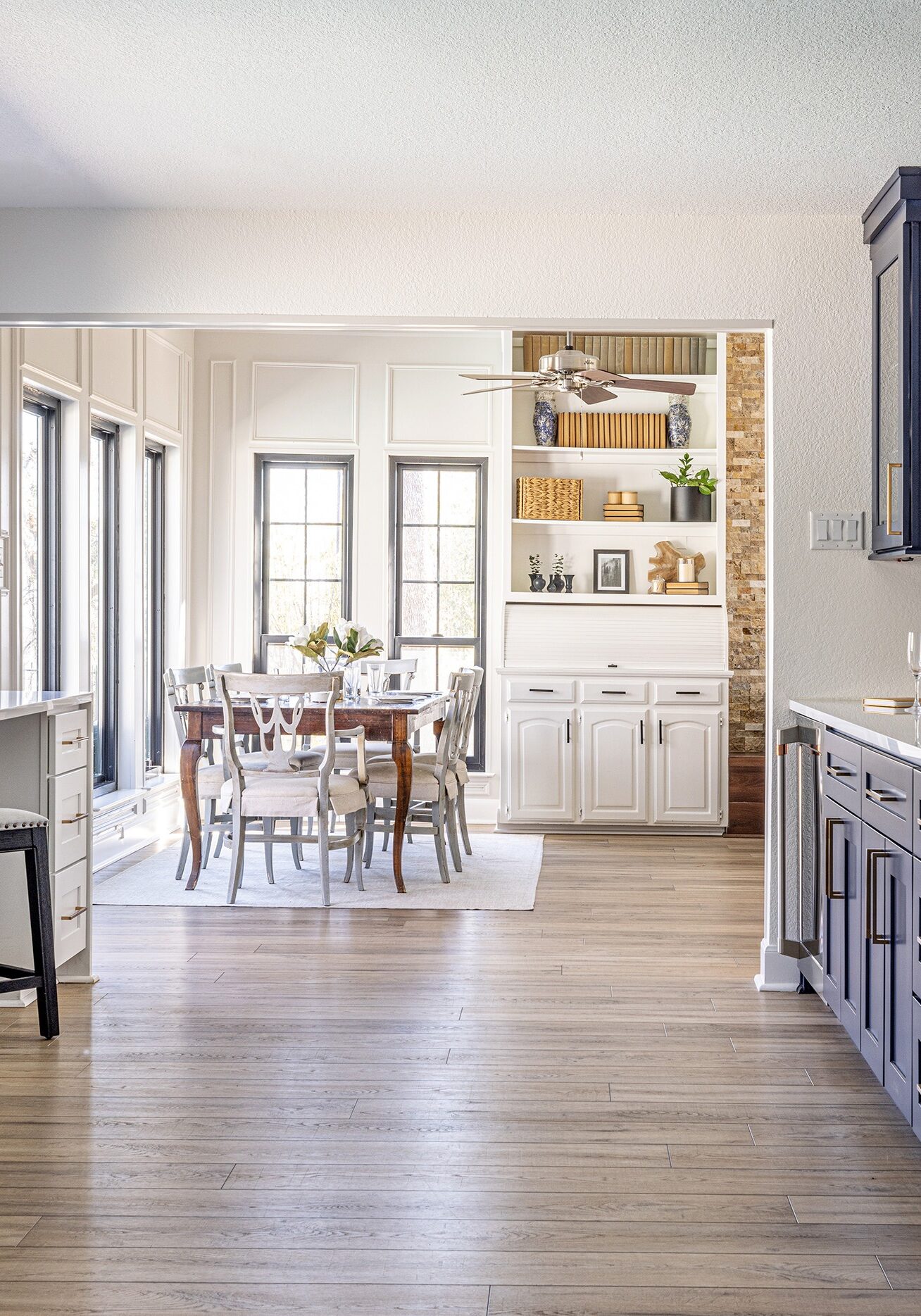
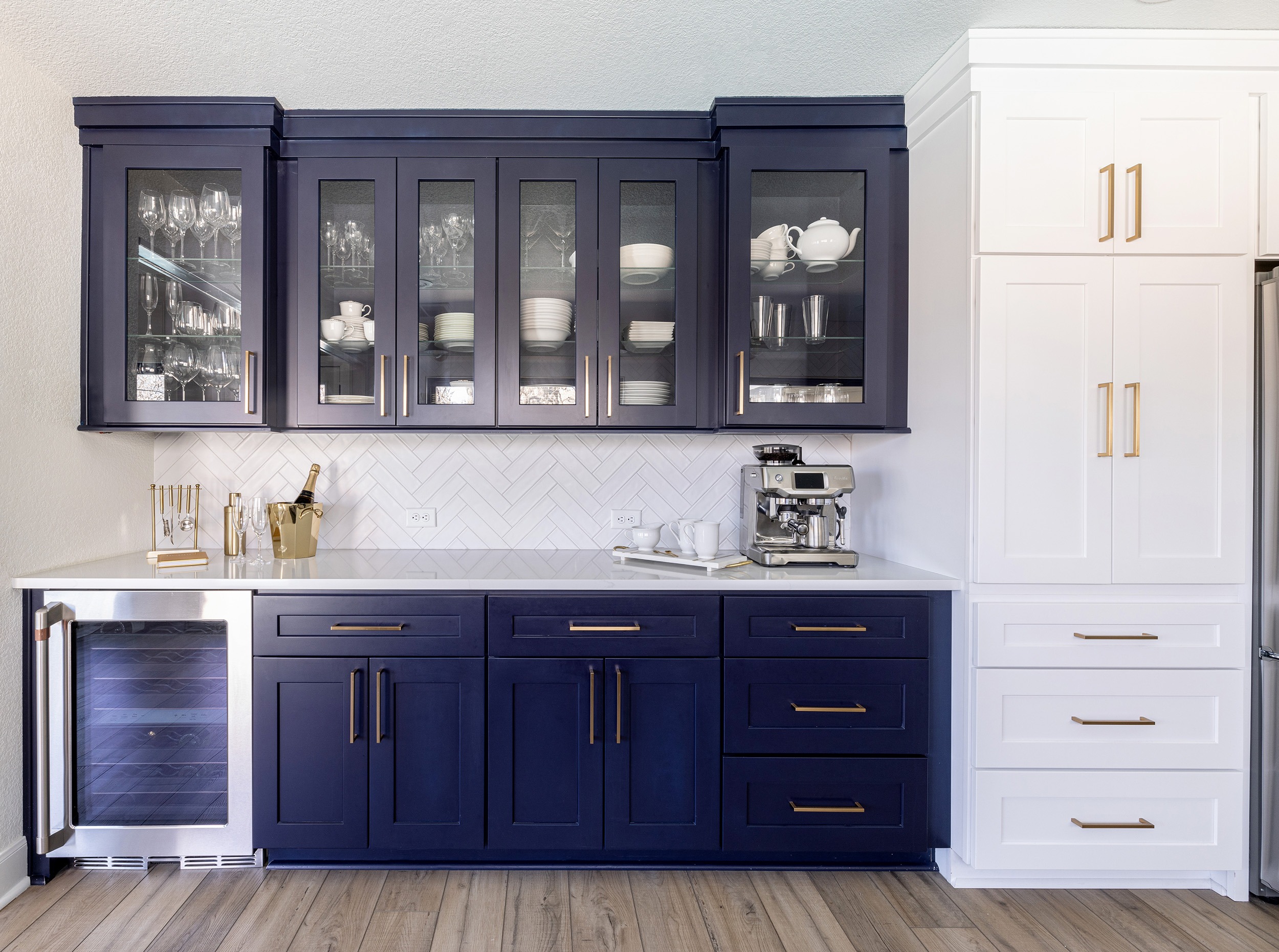
The long galley-style kitchen needed to be reconfigured for their lifestyle
The original kitchen space was as old as the house-and with the couple both working remotely, the kitchen was a critical part of their daily grind. The couple had limited natural light to work with due to the placement of the windows, and since they both love to cook, they felt robbed of the pleasure of cooking together. The space simply didn't allow it. They also needed to account for the kids doing homework nearby.
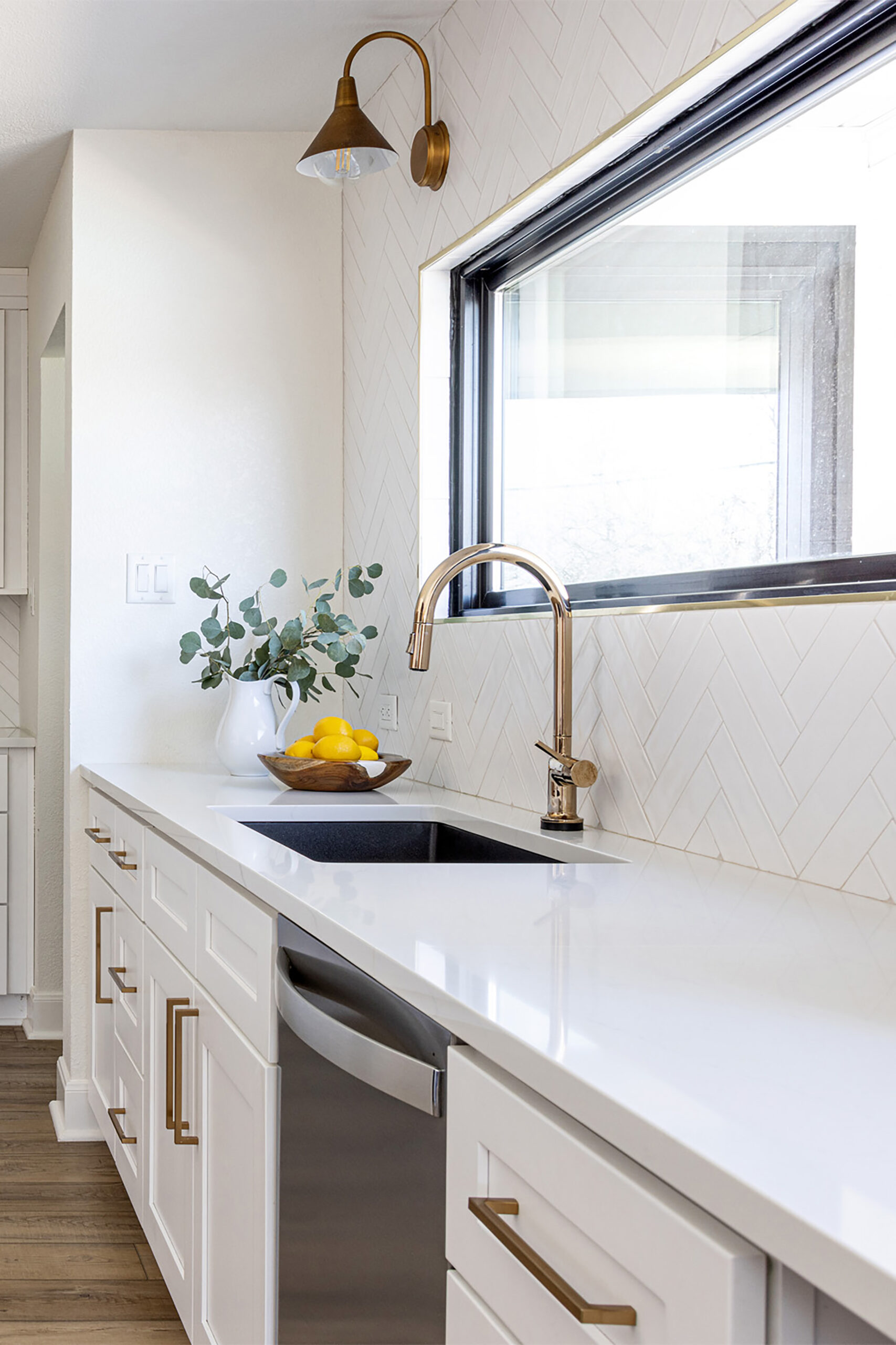
The light came on (and in) when the windows were flipped
The Signature design solutions started by pulling the new windows out and literally turning them on their side. By reinstalling the windows horizontally, natural light flooded into the long kitchen space. The full kitchen design also reworked the layout of the cabinetry and adorned the space with breathtaking design details like bright white subway tile and golden cabinet hardware.
Design priorities included:
- Allowing more natural light in for cooking and homework
- Also allowing a vantage point to watch the kids when they're in the pool
- Favoring timeless design selections that could be adorned with pops of color
- Using the long galley-style space practically for the flow of people cooking together
- Personalizing cabinets with adjustable shelves and pull-outs that fit the couple's cooking
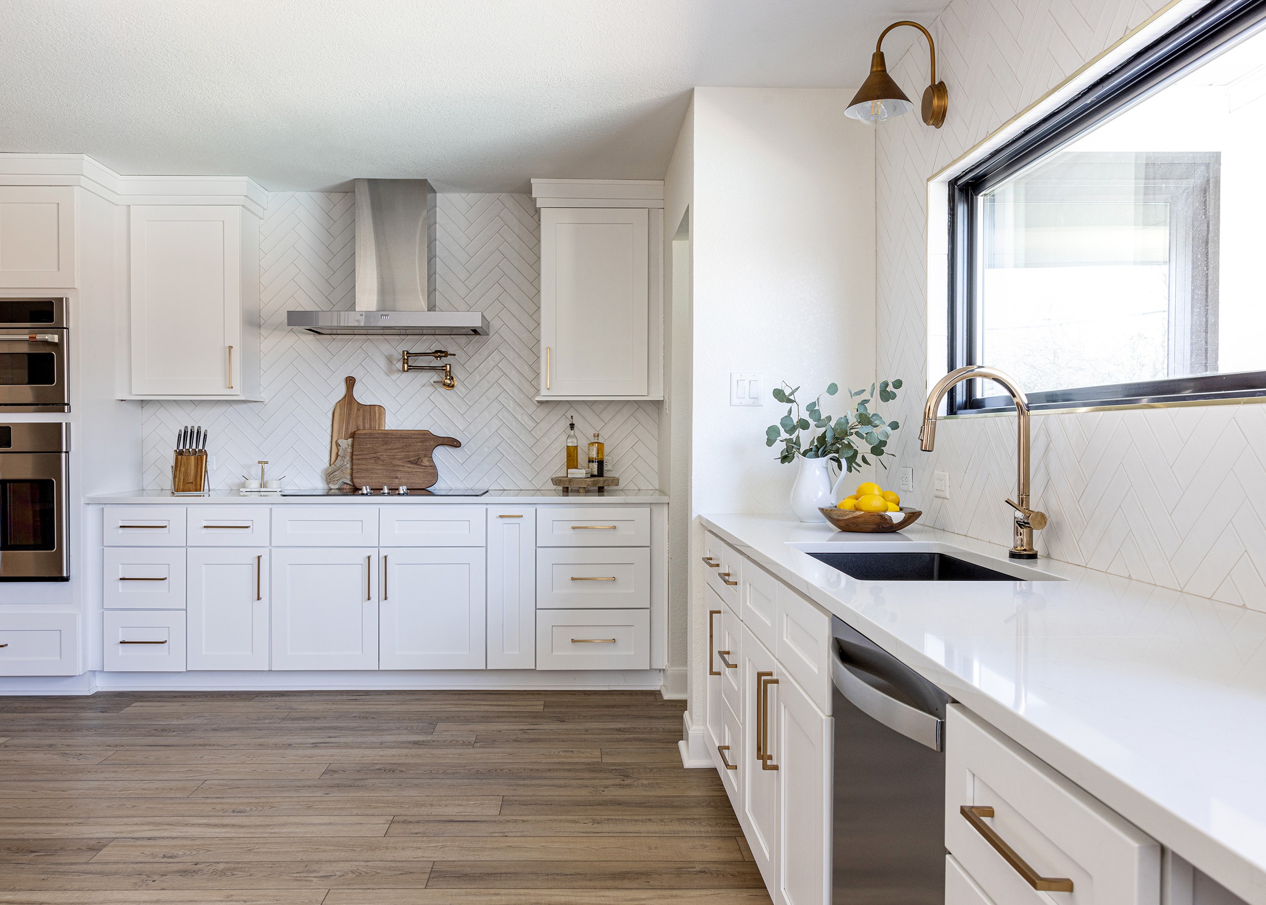
Custom solutions leveraged the Signature network of trade professionals
The kitchen had a lot of cabinetry, but it all had to be redone. The investment for a fully custom layout, however, ate up too much of what the client set aside. Compromises were made as the client prioritized key cabinetry customizations, and the final design was painted and finished locally to achieve the desired look. The older framing and the ductwork in the ceilings also presented challenges during this renovation, and so new ductwork was customized to achieve the flat, clean look that the space required.
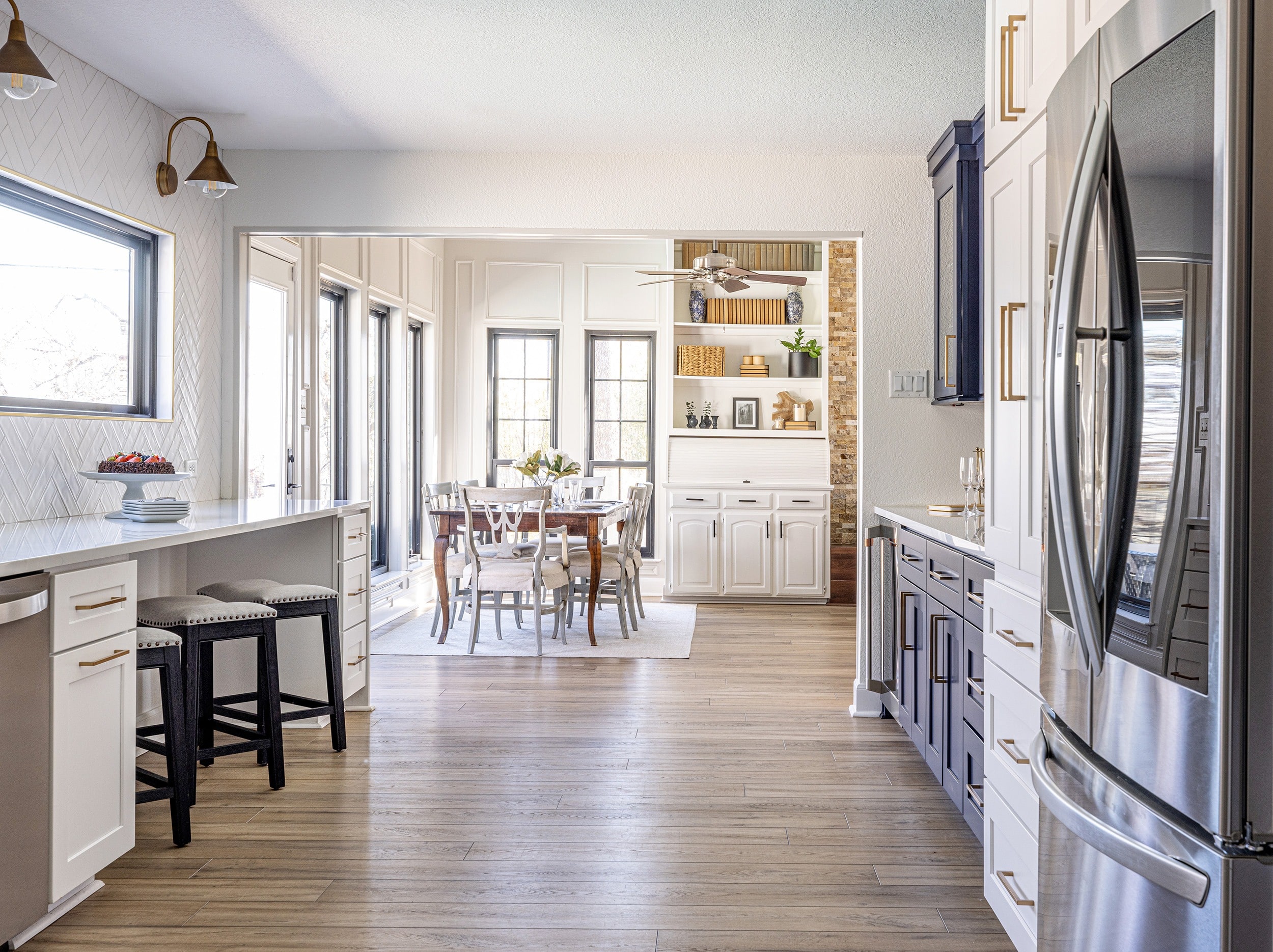
The renovation brought natural light and more time together as a family
This family loves the feeling of openness in the new kitchen and adjacent dining space. The clean lines in the custom ceiling match the timeless appeal of the new refrigeration system, wine storage, and "eye candy" white tile displays.
The use of color pops in the new flood of natural light, and the newly modernized space brings joy to the family every day.
WHAT THE CLIENTS SAY:
"Signature's work transformed not only the physical nature of the kitchen, but the flow and brightness of the home. Their work is not only of high quality, but also very functional. As a very hands-on person, I wanted to be sure I was a part of the process, and I was! Every step of the way, the team asked my thoughts and opinion, and we were able to make some game changing pivots to ensure we made the most use of the space and make it beautiful! Not only do my family and I walk in every day and love it, but we get so many compliments on the timelessness and beauty of it. Now as we all know, not everything is perfect, and while I have yet to have any concerns or changes, the team still checks in with me to see if there is anything in need of repair and if I am still enjoying the space. Good news: I am!"
DISCOVER what the SOLUTIONS in this project can mean for you


