The history of colors in interior design…
Those of us who were around then still remember the earthy greens and browns of the 1970s, for instance.
And we’ve all seen photos of the jewel tones of the 1920s!!
Do you know, though, what came before that?
When it comes to interior design trends of all kinds, our memories are hundreds of years short. Are the color palettes in the interior design trends I’m sharing on Instagram just a repeat of the 1990s? Or do they go further back than we remember?
I’d like to take you on a journey…one that answers all those questions and more. Travel back in time and you’ll see how COLOR has shaped interior design through the ages, and just how far back the “cyclical design wheel” really goes.


Interior Design and Color in the Renaissance (1400–1600)
You might call the Renaissance the beginning of what we think of when we say “interior design.” Before that, interiors were only “designed” in churches and palaces.
During this period, though, the idea of “harmony through beauty” became central to MANY other forms of creative expression. Interior design still wasn’t a “thing” of common households, but at least the wealthy got in on it. Europe’s elite began to experiment with creating spaces that were truly works of art.
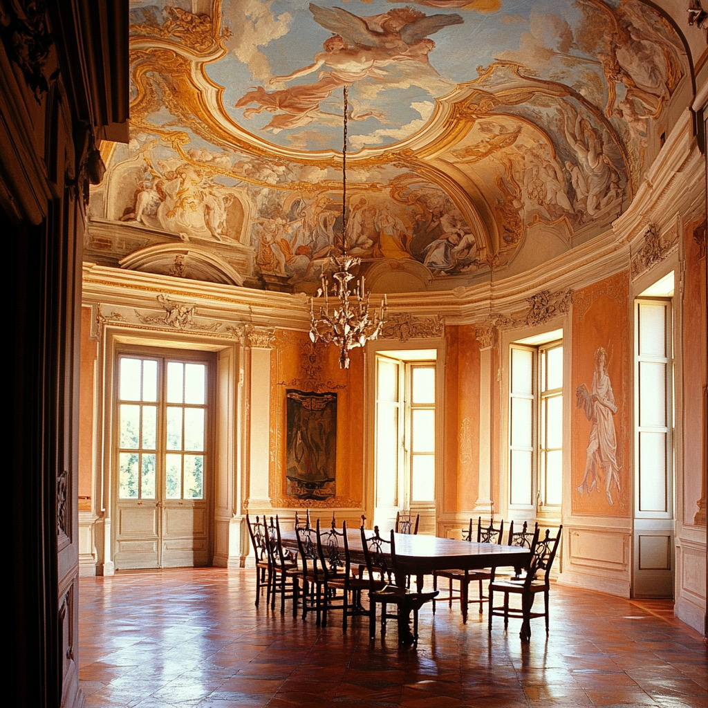
Color in Renaissance-era interiors was used symbolically more than anything. This included:
- Earth tones like terracotta, olive green, and deep gold used as a symbol of grounding
- Pastel shades of pink and blue featured in frescos and ceilings for a look of depth or airiness (and as a symbol of connection to the divine)
Remember: during this period and for a LONG time after, the pigments available were all derived from nature, and were limited to whatever minerals and plant-based dyes someone could afford.
You can just see one of these spaces, can’t you?! A dining hall with vaulted ceilings adorned with frescoes of cherubs…the sky-blue background…walls washed in terracotta tones, with the dark brown of ornate wooden furniture staged around the room…
Interior Design and Color in the Baroque Period (1600–1750)
Next, we have Baroque interiors. These were just as opulent as those in the Renaissance, but far more DRAMATIC. Think of it this way…the Baroque Period was the first age of grandeur in interiors.
Professional interior designers still weren’t common, but architects and craftsmen started working together more commonly in this period. Still, their services were primarily destined for churches, royalty, and the wealthy…
These were some of the trends of colors in Baroque interiors:
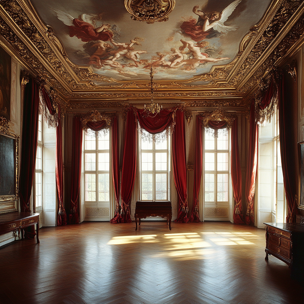
- Deep reds, emerald greens, and royal purple were the most popular hues
- Pretty much every palette always had gilded accents, too, to convey luxury
- Fabrics like velvet and silk added to the warmth and fullness of spaces, whether in drapes, upholstery, or even WALL COVERINGS!
Now…with all that in mind, think about the 1920s…do you suppose these exact same color combinations reappeared in the Roaring Twenties by accident?! They actually had historical ties to luxury and lavishness.
If you visualize a Baroque space, these colors come to life…in a Baroque palace chamber, you might see heavy red velvet curtains framing enormous windows…add a gilded ceiling fresco of a dramatic scene of clouds and angels for good measure. Natural wood furniture sits polished with thick lacquers, and every surface literally gleams with opulence. Can you see it?!
Interior Design and Color in the Rococo Period (1720–1780)
If you’re rusty on your Rococo history, this period brought a much-needed fresh take after the intense and crowded Baroque Period. In the Rococo era, lightness, playfulness, and a new definition of intimacy came into interiors.
It was also during this time that interior design became MUCH more personalized. It catered instead to the individual likes and lives of wealthy families. It was still the domain of the rich, but it was in this period that it became a focus in homes more than ever before.
These are some of the color trends of the time:
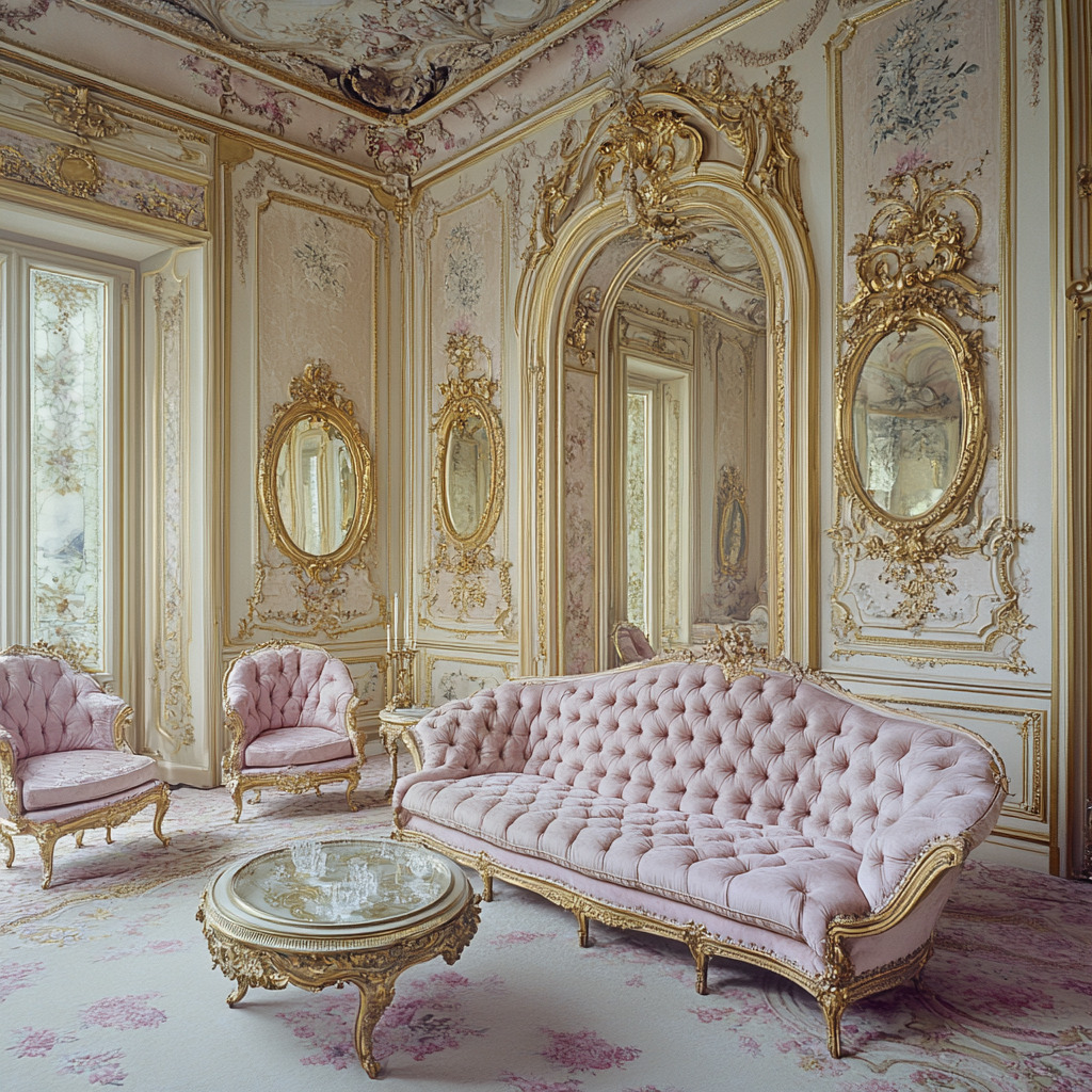
- Pastels reigned supreme during the Rococo Period!! Think soft blues, delicate pinks, warm creams, and light mint green…
- Gold accents were still big, but were applied with a lighter touch
- Intricate floral patterns started bringing a sense of romance into interior design
The next time you go on a tour or see a period film where Rococo designs pop up, you might recognize it for its cream-colored walls or pastel pink upholstery. Maybe the tufted furniture will give it away. Look for features like gold framed mirrors or ethereal staging that invites relaxation and conversation.
Interior Design and Color in Neoclassical Design (1750–1850)
As we creep closer to modern day, interior design takes a HUGE step back in its inspiration. The Neoclassical Period in interior design reflects a return to ancient Greece and Rome, inspired by the era’s ideals of “reason and order.”
Professional interior designers did begin to emerge in earnest during this time, and they catered at first to the new demand for refined, symmetrical (and therefore “orderly”) spaces. The wealthy were still those homes served, but the middle class started to embrace Neoclassical design principles, too.
You can recognize these color trends seen during this period:
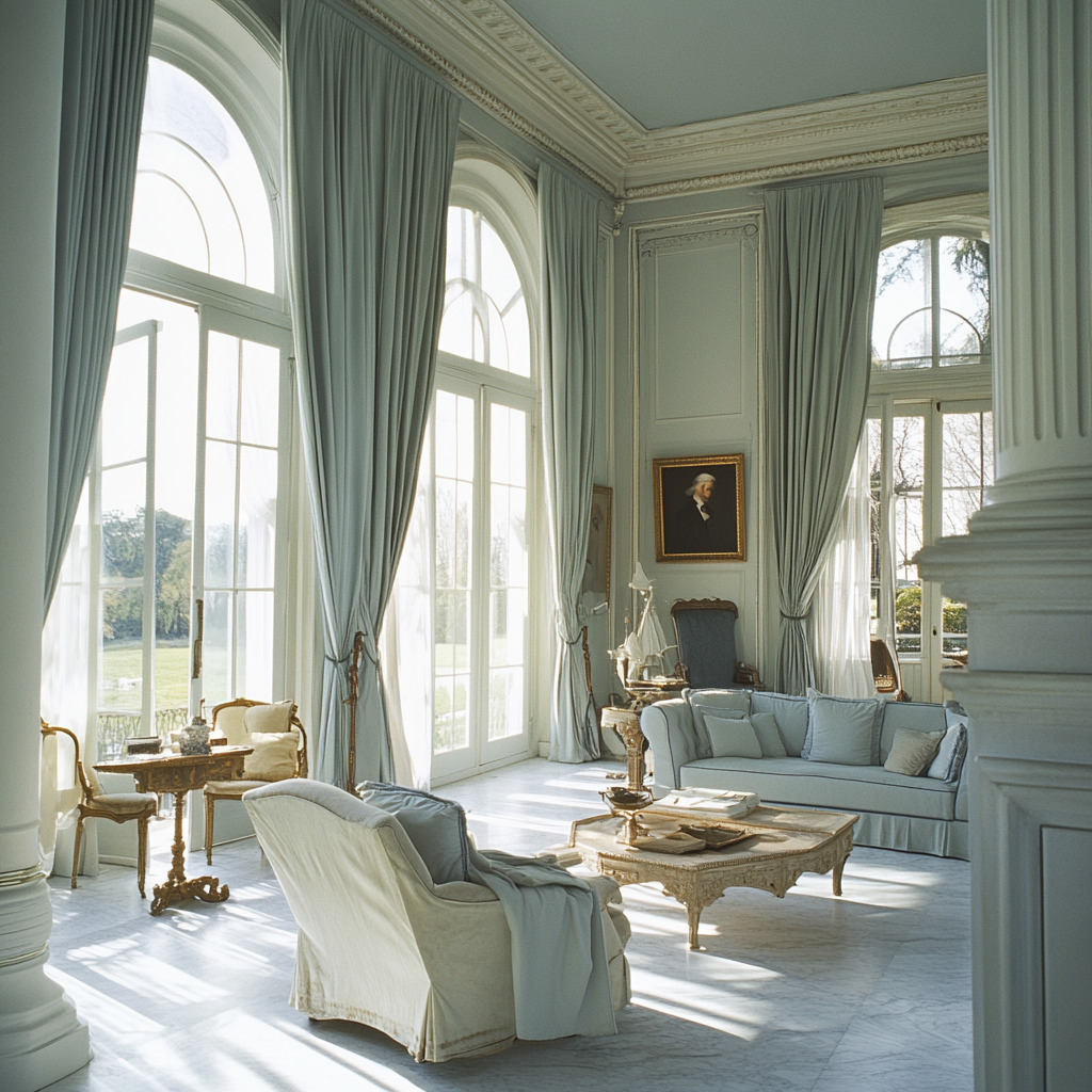
- Restrained color palettes using whites, creams, and softy grays
- Accents of other muted colors like the lightest greens and blues
- Gold used sparingly (for an emphasis on refinement over excess)
Ask yourself, right now: do these color trends sound familiar?! These palettes are exactly what we saw in the final stage of the minimalist interior design wave of the early 2000s…
To picture a Neoclassical design, start with a solarium with lofty ceilings and white plaster moldings. What you see of the walls between the tall windows is all painted soft gray. Each of the windows has pale blue drapes pulled back to allow the light in. Calmness and restraint define the room.
Interior Design and Color in the Victorian Era (1837–1901)
Are you ready for the Victorian Era?! This period was about excess all over again…but with eclecticism mixed in. The Industrial Revolution made interior design FAR more accessible to a growing middle class, and new synthetic dyes and pigments made any and every color possible!!
Suddenly, most middle and upper-class homes were filled with ornate and heavily decorated interiors. Professional interior designers didn’t grow much in number, though, because homeowners were enthralled with novel catalogs and magazines that were also born in that time period.
Color trends during the Victorian Era included:
- Rich and saturated everything
- Burgundy, forest green, navy, and gold seen together in intricate wallpapers and upholstery
- Vibrant new hues (thanks to synthetic dyes), starting with multiple shades of purple after the first-ever synthetic dye (mauve) was made
Color and eclecticism…surely THAT sounds like a familiar design trend, too?! Today’s maximalism has tons of trends that we can tie back to the Victorian Era. These trends really are cyclical…and further back than you might have thought!!
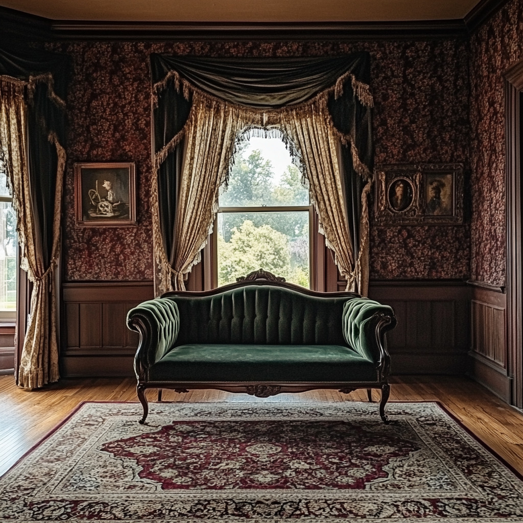
Walk now into a Victorian Era parlor with thick, patterned, burgundy wallpaper…as you step into the center of the room, you sink a little into the patterned Persian rug underfoot. The sofa in one corner has a low sit, high arms, and is covered in dark green velvet. Heavy drapes frame the windows and pool on the floor, and gilded picture frames sparkle softly in the low light.
Interior Design and Color in Art Nouveau (1890–1910)
Yes, there was “that one period” between the Victorian Era and the Roaring Twenties: Art Nouveau. This era introduced organic forms and nature-inspired motifs into interior designs, right at a time when professional interior designers gained real prominence.
Seen as artists, interior designers were now central in creating cohesive spaces. And the color trends of the time dictated…
- Soft, nature-inspired colors like olive green, lavender, and mustard yellow
- Natural colors paired with metallics, especially bronze and gold
- Intricate patterns flowing from every aspect of design, from stained glass to the upholstery
With natural colors paired with bronze and gold accents, it’s hard NOT to think of today’s biophilic interior design. Look where some of that inspiration originally came from!!
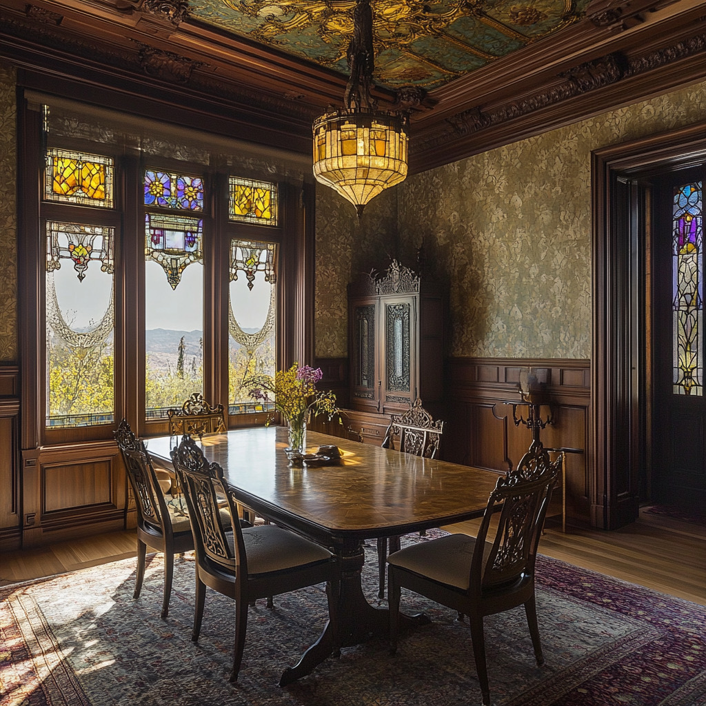
For instance, you can picture a dining room with olive-green walls standing as a backdrop to natural wood furniture with bronze accents, each chair’s arms carved with floral designs. A stained-glass window with lavender and mustard yellow filters pale, lightly colored patterns into the room. Are you in a 2024 home with biophilic elements, or in an Art Nouveau space?! You decide…
Interior Design and Color in Art Deco (1920s–1930s)
Glamour was definitely BACK in the Roaring Twenties. Interior designers and architects became integral to the modern and luxurious spaces, and a growing number of households contracted those professionals. As Art Deco unfolded, it granted more attention than ever to elements of functionality in design, which made it appealing not only in homes, but in commercial spaces.
The color trends of the 1920s included:
- Bold and saturated colors, especially jewel colors (green and red) paired with black and gold
- Geometric patterns and contrasting tones adding drama and sophistication
- Metallics like brass and chrome to bring in a new, futuristic edge to design
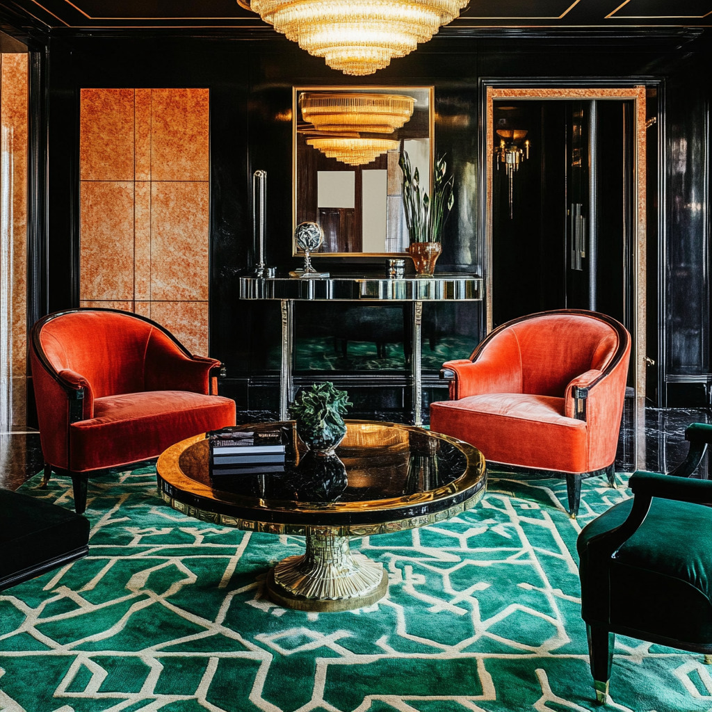
Can you see it?! Put these elements in a living room with black lacquered furniture and ruby-red velvet armchairs. An emerald green rug with geometric gold accents could sit in the center of the room. A mirrored coffee table could reflect the light beautifully from a dangling chandelier…
Interior Design and Color in Mid-Century Modern (1940s–1960s)
Ah yes…the Mid-Century Modern…by the time we get to these interiors, we’re back to simplicity…again!! But now, it’s mixed with even more functionality and warmth, reflecting the household values of the time. This is when interior design BOOMED, too, and new resources like devoted design publications gained traction.
The color trends included:
- Earthy and muted yellows, teals, greens and browns mixed throughout design
- Clean lines and organic forms in furniture, accessories, and décor
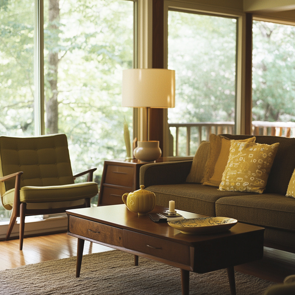
Just flip through a vintage magazine from the 1950s to see spaces like this. You might find a living room with olive-green linen-upholstered chairs, a teak coffee table, and muted yellow throw pillows on the brown sofa…it’s SO mid-century!!
Interior Design and Color in Postmodernism (1970s–1990s)
Postmodernism rolled in as the new interior design style in the 1970s and flat out rejected the “rigidity” of modernism. Instead, it turned back to boldness and—especially—individuality.
Interior designers of this period embraced the eclectic styles of their growing client books. A longer list of homeowners wanted their spaces to make a statement, and they wanted it to be a statement in line with their lifestyles and beliefs.
This played out in the following color trends:
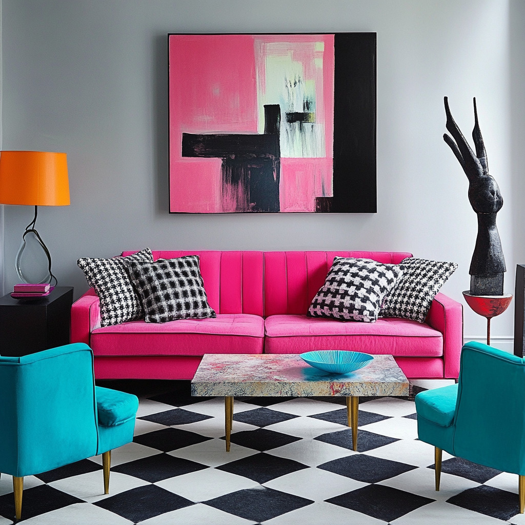
- Bright and playful color palettes, including shades like neon pink, turquoise, and purple
- Colors paired with neutral tones and unconventional patterns, offering a layered effect
- Color used specifically to challenge norms
You probably remember spaces like this…whether you were born in a home with spaces like this, or remember visiting a grandparent’s home that did. Picture a living room with a neon-pink sofa, turquoise accent chairs, and a black-and-white checkered rug. Mix in some abstract art in with quirky décor, and it’s a playful atmosphere, no doubt!!
Interior Design and Color in Minimalism (2000s–2020ish)
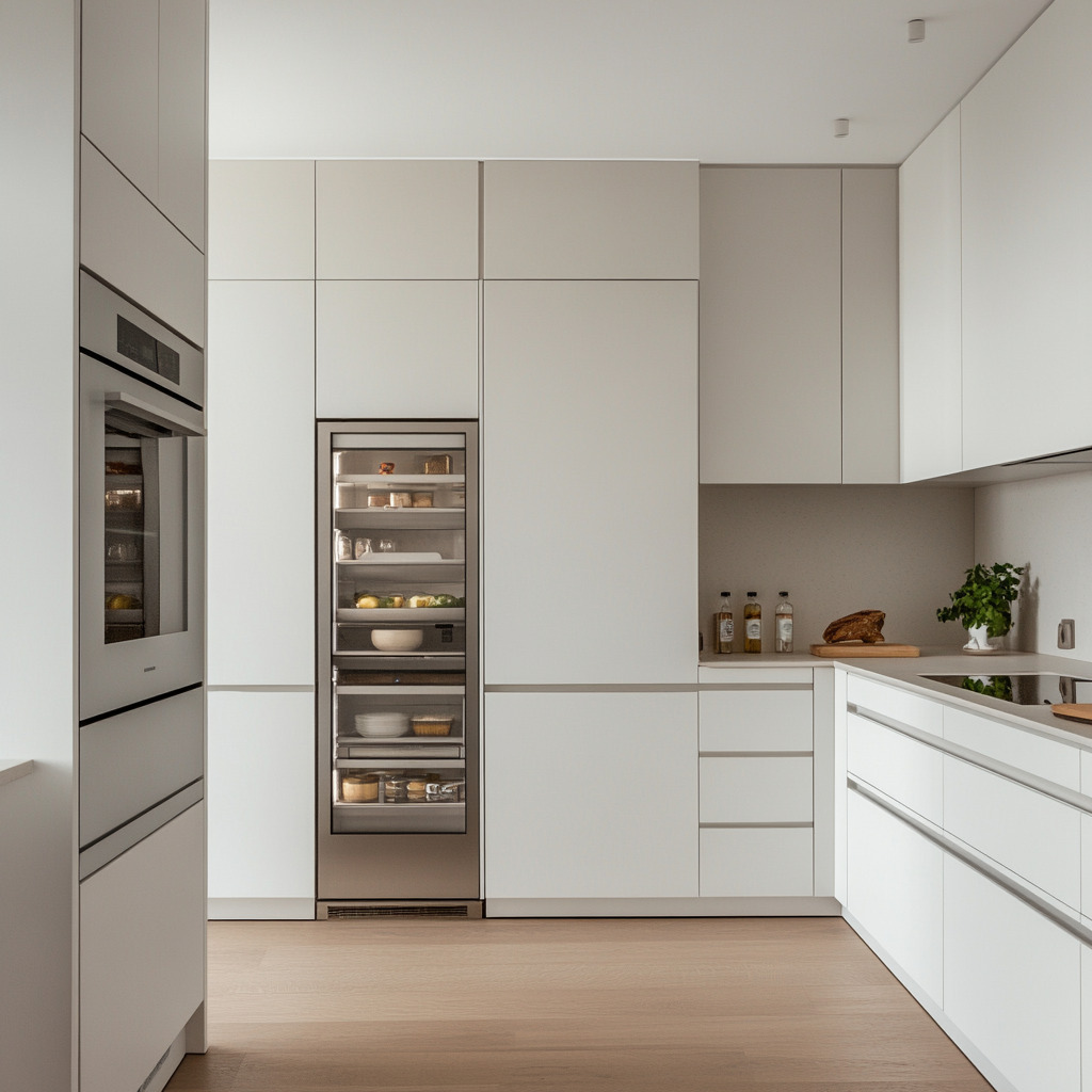
After all those visually busy spaces through the 1990s, modern minimalism came rolling in. Personally, this was my least favorite interior design trend…you remember the scenes: interiors emphasizing white cabinets, gray or greige everything, hidden built-in appliances and storage, and VERY few things on the walls!!
The color trends that dominated were:
- Neutral palettes of whites, grays, and beiges
- A token bold statement color to add a “pop,” if that…
This design style started to lose favor after 2015…then it REALLY took a nosedive after 2020. With more people than ever working from home, and people redefining HOW they wanted to live in their homes, bold colors and maximalism came back!!
I’ve been thrilled!
Keep reading to see what today’s color and interior design trends are, how they changed EVERYTHING about our use of color, and just how quickly they changed. And now, wherever you look, you’ll see which other previous design eras today’s trends point back to, starting with today’s use of color!!
About the author:
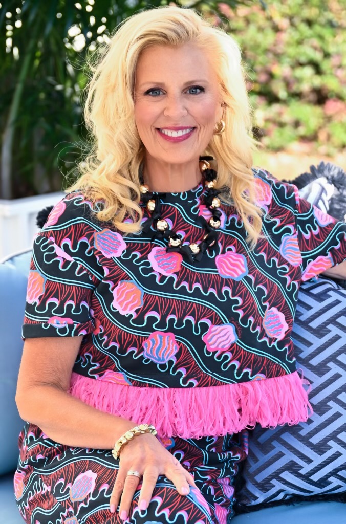
Robin Burrill, RID, NCIDQ, ASID, IDS, CAPS, is an award-winning professional kitchen, bath, and interior designer. Robin and her husband, Robert Mathews, have owned Signature Home Services, Inc. for nearly three decades, establishing a superior in-house team with a widespread reputation for delivering meticulous design to their many repeat clients.
In 2022, the national publication, Kitchen and Bath Design News magazine, named Robin to their Top Innovator list in recognition of her achievements in the field of kitchen and bath design. In 2024, she was named one of the Fall 2024 Market Pros and “tastemakers” by ANDMORE at High Point Market. Also in 2024, Fixr identified her as one of the Top Professional Interior Designers for their nationwide audience. Over her extensive career, Robin has been quoted in Architectural Digest and Forbes multiple times; her design work has been featured in top national trade publications; and she has been interviewed for Designers Today magazine’s “Profiles in Design” video series, among others. Widely respected for the depth of her knowledge, Robin is a sought after speaker and judge for many design industry events.
In 2023, Robin designed a bench for Charleston Forge, making her foray into product design. Robin currently serves as a volunteer on the board of the Dallas/Ft. Worth chapter of the Interior Design Society.


Leave a Reply